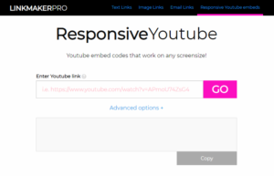
Responsive Youtube Embedding
Black bars be gone! A website and jQuery plugin for responsive Youtube embeds at any aspect ratio, without the black bars.
Responsive web design has been the default for many years now, so it continues to surprise me that Youtube doesn’t offer an option to make the video embed code it provides responsive. There have been a number of solutions to the issue, most notably fitvids.js, an almost-perfect jQuery plugin by Chris Coyier and Paravel.
“Almost-perfect”? I hear you cry? Yes, while it is a wonderfully small, elegant and easy-to-use solution for making video embeds responsive, it assumes that the <width> and <height> attributes provided with the Youtube embed code represents the correct aspect ratio for the video. This is unfortunately not the case as Youtube’s embed code provides all video embeds in a 560-by-315 format. This is correct for videos filmed in a 16:9 ratio (which, to be fair, is the most common these days), but for videos in any other aspect radio (for example 4:3, 2.89:1, or any video shot in portrait on a mobile phone), unless you are willing to tinker with the <width> and <height> attributes of every individual embed code you use, your videos will have ugly black bars added to the sides in order to shoe-horn the video into a 16:9 box.
If you can live with the black bars then that is fine, I whole-heartedly recommend fitvis.js and wish you a long and happy life together. However, if the black bars bug the hell out of you then there is a solution. The Youtube Data API allows you to send an ajax call with a video ID to Youtube and receive back information about that video, including the videos original dimensions. We can use these dimensions to resize the Youtube iframe to the correct aspect ratio for the individual video, set the width to 100% with CSS and, hey presto, a resonsive video at the correct aspect ratio and not a black bar in sight!
I’ve created two tools to automate this process:
Firstly a website. Here you can simply paste in the Youtube URL, the website will then query the Youtube Data API in the background and provide you with a custom embed code with built in CSS to display the video at the correct aspect ratio.
Secondly I’ve created a jQuery plugin which can be added to any page containing Youtube videos and, once initialised, will automatically query the Youtube Data API and resize all videos to the correct aspect ratio and make them responsive. However, the plugin does require you to first sign up for an Google API key in order for the plugin to be able to retrieve aspect ratio data from the Youtube Data API.
I’d love to be able to say that my plugin is a perfect solutions to the problem of making Youtube videos responsive, but in reality there are cons and well as pros to this approach compared to the Fitvids.js approach. Fitvids.js does not require you to register for an API key, so is a bit quicker to set up. Fitvids.js is also entirely client-side, so on slow internet connections is likely to be faster than my solution which requires a separate API call for each video on the page. Fitvids.js also has the added bonus of supporting other video hosts, such as Vimeo and Viddler.
I’ve summed up the differences below, hopefully this will help you decide which solution is the best for you.
| My plugin | Fitvids.js | |
|---|---|---|
| Makes Youtube videos responsive? | Yes | Yes |
| Videos have correct aspect ratio? | Yes | No |
| API key needed | Yes | No |
| Entirely client-side | No | Yes |
| Supports multiple video hosts | No | Yes |


