Case Study: Peter Ross Art
 My dad is an amazing artist, but he’s also an incredibly modest chap and hates blowing his own trumpet so when it comes to self-promotion he is a dead loss. It took me ages to persuade him that he needed a website to promote his art so when he finally relented his only request is that it would be something simple.
With ‘simple’ in mind I set out to design a simple 2-column website, with a page for news, one with biographical information, a contact page and of course a gallery.
As Pete’s art is what we really wanted to show off I toyed with the idea of having the gallery as the main homepage, but ultimately decided that a better option was to feature an animated slideshow of Pete’s work alongside news on the home page.
The colour scheme was another issue to which I gave some serious thought. My initial impulse was to create a website that mimicked a typical bricks-and-mortar art gallery, which typically feature white as the main wall colour. However, Pete was more keen on having a darker looking website, to reflect not only the mood of his paintings but also the black cover of the book he was shortly publishing. While I have my reservations about this, I went ahead and designed a black/grey/white colour scheme for the website.
The website is powered by WordPress using a heavily modified version of the TwentyTen theme. Post categories are used to allow Pete to easily add new artwork to the various gallery sections and news items to the home page.

A Podcast to the Curious – The M.R. James Podcast
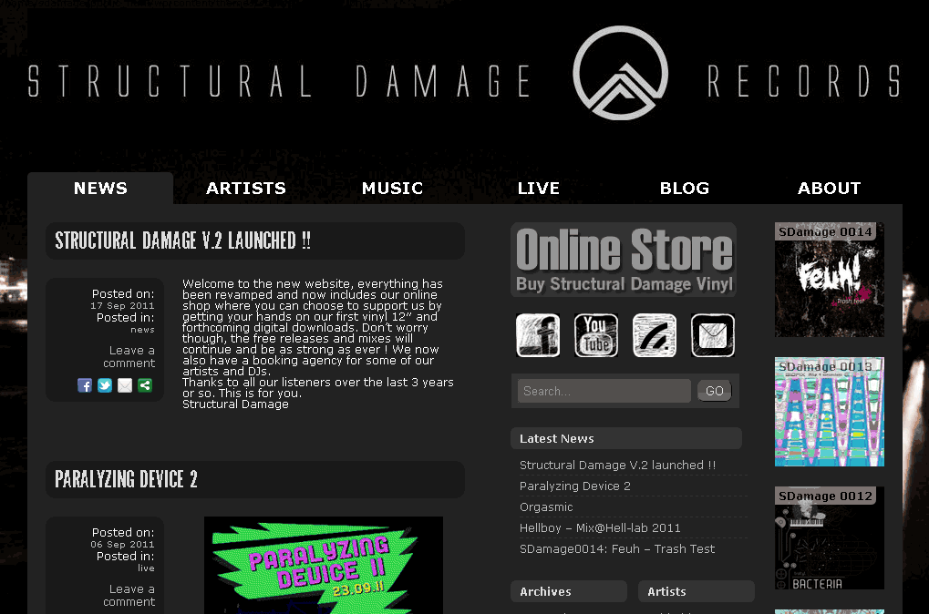
Case Study: Structural Damage Records
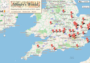
Case Study: Monty’s World
About Author
will
Hi, I'm a frontend web developer based in Oxford. I'm currently working as a Digital Producer for Oxfam GB. When I'm not coding, I can usually be found podcasting, reading, gardening or listening to noisy electronic music.